UX CASE STUDY > AVR Abfall
Redesigning the iOS app “AVR Abfall” of the Rhein- Neckar waste disposal company AVR
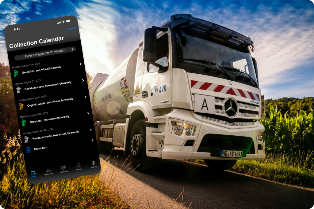
Task
Redesign an app of choice as a solo project. Select an app, well known to you, ideally with UX and design issues to address. The issues shall be identified by testing the app and classified by doing a heuristics evaluation (no other UX methods shall be used). Based on the heuristics evaluation, 3–7 screens shall be redesigned and the changes could range from updating components, over redesigning entire screens to redefining the brand’s identity.
App selection: AVR Abfall
Based on the task description, I chose the iOS app “AVR Abfall” of the Rhein-Neckar waste disposal company AVR. I am regularly using this app and I saw some deficiencies especially in UX. The main features of the app are
- to inform about regular waste collection schedules (this is important in my region as bins will only be emptied when the house owner puts them onto the sidewalk on time)
- to create collections on demand (e.g. to collect bulky waste)
- to educate users about how to dispose specific waste items correctly (e.g. paint remainders, electric devices).
Heuristics evaluation
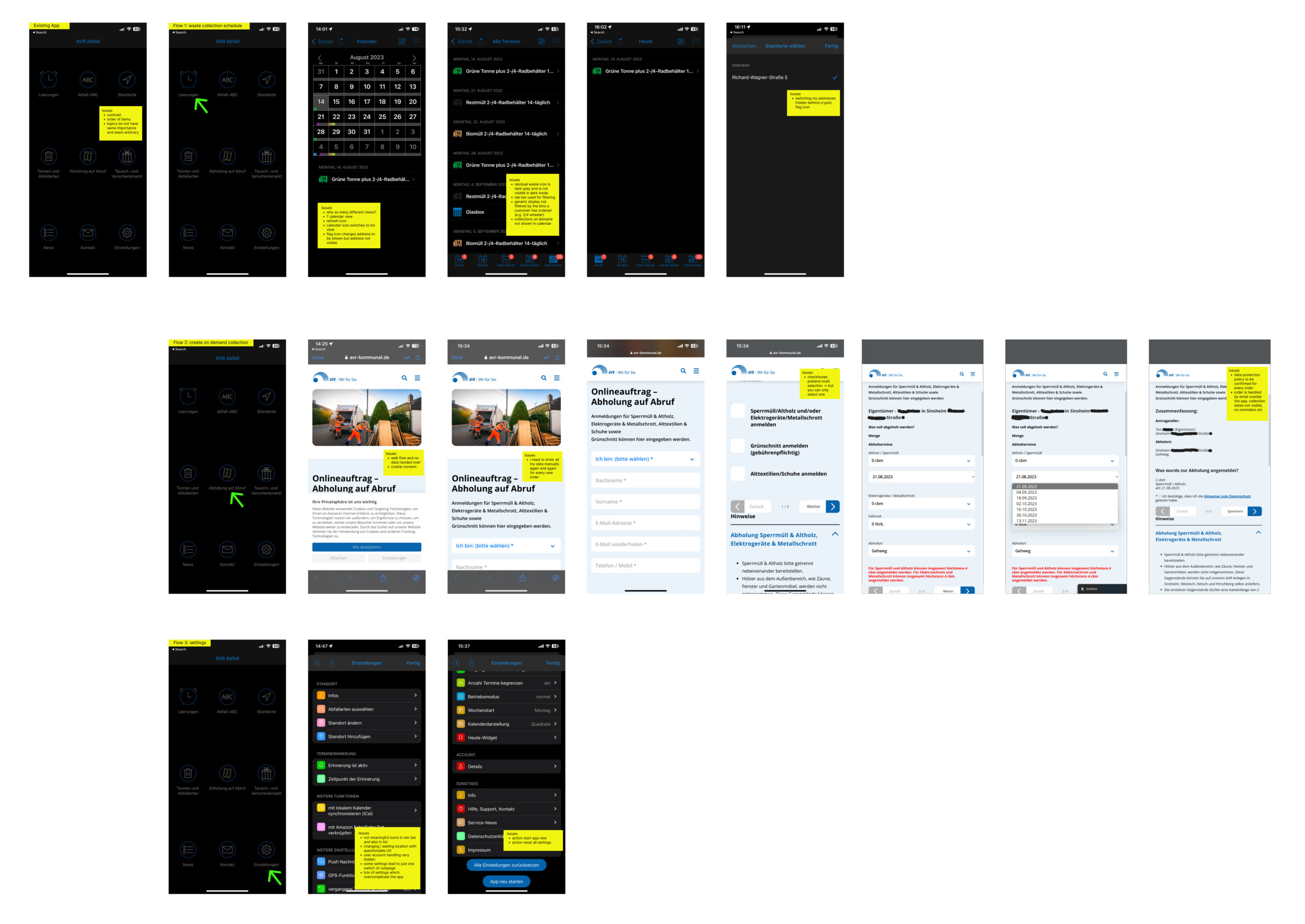
I started my evaluation by thoroughly testing the app. I listed down 37 UX and design deficiencies, clustered them according to Nielsen heuristics, prioritized the severeness and ideated high level about a possible solution for each of them. Given the scope to redesign 3–7 screens, I decided to focus on the home screen, the collection calendar, the flow to create a collection on demand and the settings. The app has more potential for rework, however.
Screenshots with my notes from testing
Ideation
(1) Home Screen
The home screen has currently 9 tiles, the items are not really sorted logically and they also do not have the same importance. Therefore I decided to replace the current home screen with a standard Apple tab bar, combining the existing 9 items into just 5 items (remark: in a real project, this task would have been an ideal example for card sorting with real users but UX work was not in scope in this weeks challenge and therefore I just used my common sense to combine the topics. Later user tests with my prototype confirmed that my suggestion worked well).
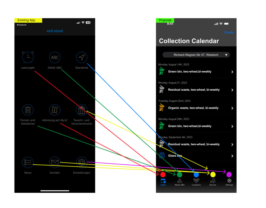
Proposed main navigation with welcome screen:

(2) Collection calendar
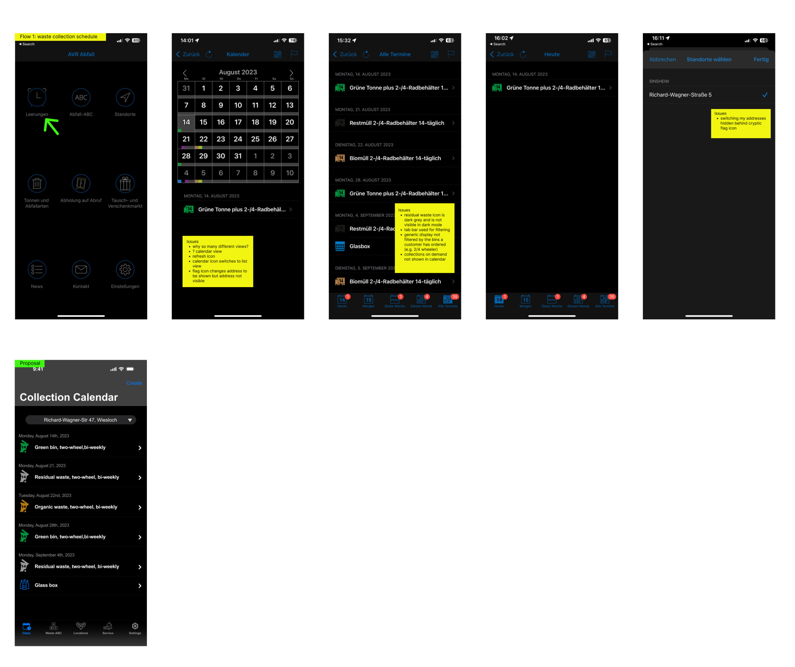
I decided to have just one list view instead of a not so usable calendar view plus a list view. I also decided to not offer any filter. This simplifies the UI and the interaction a lot. I cleaned up the icons and also made the address visible right at the top of the screen. If the user has multiple addresses, there will be a drop-down, otherwise just the text.
(3) Create collection on demand
Most important change is the switch from a non-integrated web-flow to a native in-app-flow which is using the existing user- and address data. The user does not have to manually enter all the data anymore but it is already pre-filled when starting the flow. I created multiple alternative flows as paper wire frames, all with slightly different interaction flows (e.g. radio buttons or check boxes before entering data). I finally decided to simplify even more and leave the separate selection step away and to offer this option in a drop-down on the same screen. Another important differentiator is that the on-demand collection now shows up in the collection calendar of the user. Before, it was possible to e.g. display all bulky waste collections but the one I booked was not highlighted but just shown like all the others.
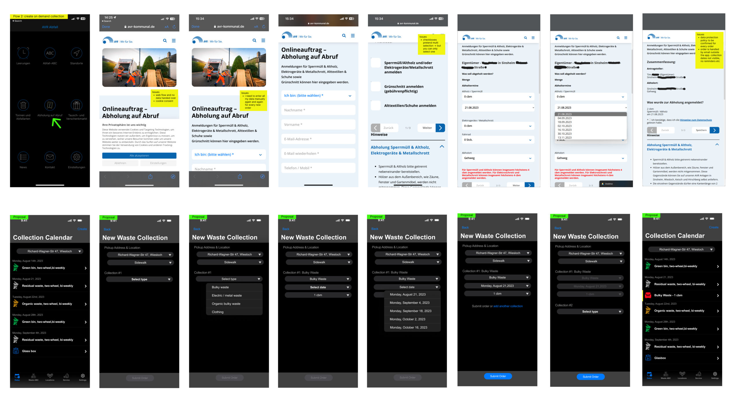
(4) Settings
I reorganized the settings and removed items, which from my point of view might not be used heavily. In a real project, such a decision will have to be done based on usage data which I obviously did not have at hand. I furthermore decided to not have icons except for the user handling which also gives the account handling a much more prominent position than today.
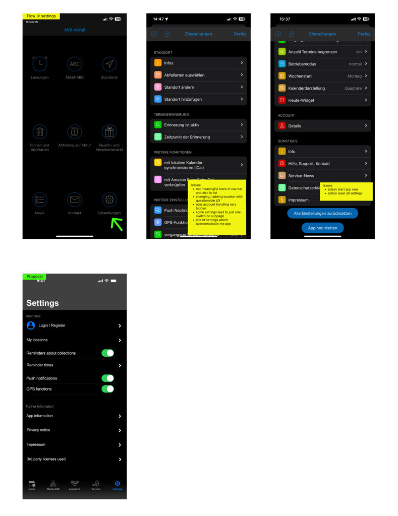
Design critique
We conducted two design critique sessions during the project week. The first one was done internally on Wednesday afternoon based on an early version of the app. And the second one was conducted on Friday afternoon with experienced external designers based on the final version of the app.
Especially from the first round, I received a lot of valuable feedback which I tried to incorporate as much as possible into my design:
- The team found spelling errors in my design
- The flow to create an on-demand collection was not yet good enough. I completely redesigned it once more after the critique session
- The place to trigger the on demand collection from the collection calendar view via the “create” action was not understood by everyone. As a consequence I added it to the services section as well
- One participant did not like the dark mode. Remark: I still kept it assuming that there will be both a dark and a light mode of the app following the standard iOS setting.
- One participant found the design of the app quite old fashioned. Remark: By purpose, I decided to use the iOS design library and go with the standard Apple design system as much as possible out of two reasons: (1) It is efficient to implement, (2) The purpose of the app is to efficiently inform and help users and it is not a lifestyle app. As a reaction to the feedback, I created a welcome screen that gives the user a bit more pleasant first impression.
The second design critique session on Friday worked pretty smoothly. It was very beneficial to have a first session on Wednesday and also running user tests before the final presentation to confirm that all the changes worked out well.
You can access the Figma file I used for Friday’s design critique session here. It guides you from the issues identified to the solution.
Final design / prototype
Are you curious to see how that all goes together? Here you can test my final Figma prototype.
